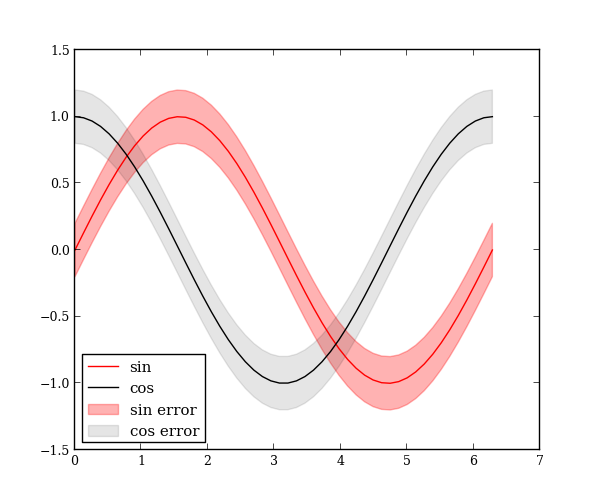
Plot errorfill
When you have continuous data measurement and errors associated with every data point, plotting error bars can get really noisy. special.errorfill plots a filled region to represent the error values instead of using individual bars.
import numpy as np
import matplotlib.pyplot as plt

from mpltools import special

x = np.linspace(0, 2 * np.pi)
y_sin = np.sin(x)
y_cos = np.cos(x)

y_err = 0.2
special.errorfill(x, y_sin, y_err, label='sin', label_fill='sin error')
special.errorfill(x, y_cos, y_err, label='cos', label_fill='cos error',
                  alpha_fill=0.1)
plt.legend()

plt.show()

Python source code: download (generated using mpltools 0.2dev)
