When plotting a series of lines, it's nice to pull a series of colors from a colormap (especially if there's some sequential relationship between lines). In fact, this has been asked (and answered) multiple times on the Matplotlib mailing list (e.g., [1] and [2]) and on StackOverflow (e.g., [3] and [4]).
Sequential curves
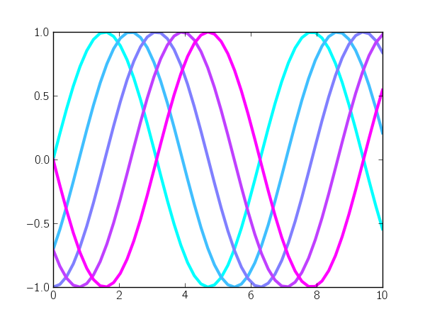
Matplotlib makes it really simple to use evenly-spaced intervals of a colormap: you just call the colormap with evenly-spaced values between 0 and 1. For example, let's plot a sinusoidal curve with different phase shifts and use colors from the "cool" colormap to color each curve:
import numpy as np
import matplotlib.pyplot as plt

n_lines = 5
x = np.linspace(0, 10)
phase_shift = np.linspace(0, np.pi, n_lines)

color_idx = np.linspace(0, 1, n_lines)
for i, shift in zip(color_idx, phase_shift):
    plt.plot(x, np.sin(x - shift), color=plt.cm.cool(i), lw=3)

plt.show()
Alternatively, you can set the color cycle of the plot axes:
ax = plt.axes()
ax.set_color_cycle([plt.cm.cool(i) for i in np.linspace(0, 1, n_lines)])
for shift in phase_shift:
    plt.plot(x, np.sin(x - shift), lw=3)
I prefer this method because the loop definition is a bit simpler (i.e., no call to zip). I've added this method to a utility package called mpltools:
from mpltools import color

ax = plt.axes()
color.cycle_cmap(n_lines, cmap=plt.cm.cool, ax=ax)
for shift in phase_shift:
    plt.plot(x, np.sin(x - shift), lw=3)
The cycle_cmap function doesn't really save that much typing, but I find it easier to read, nonetheless. Also, it has some pre-defined limits for colormaps to prevent use of very-light colors (which have low-contrast on white backgrounds).
Choosing colors for a varying parameter
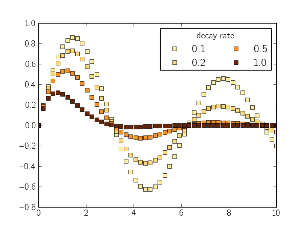
A related concept arises when you want the line color to match a parameter value. This is slightly more complicated because you need to normalize the values you pass to the color map.
Below, I plot a sinusoidal curve with different rates of exponential decay and label those rates with different colors:
pvalues = np.logspace(-1, 0, 4)
pmin = pvalues[0]
pmax = pvalues[-1]

def norm(pval):
    return (pval - pmin) / float(pmax - pmin)

x = np.linspace(0, 10)
for pval in pvalues:
    y = np.sin(x) * np.exp(-pval * x)
    color = plt.cm.YlOrBr(norm(pval))
    plt.plot(x, y, 's', color=color)

leg = plt.legend(['%0.1f' % v for v in pvalues], ncol=2)
leg.set_title('decay rate')

plt.show()
To simplify this process, I wrote a simple factory function (function that returns a function) called color_mapper:
from mpltools import color

pvalues = np.logspace(-1, 0, 4)
prange = [pvalues[0], pvalues[-1]]
map_color = color.color_mapper(prange, cmap='YlOrBr')

x = np.linspace(0, 10)
for pval in pvalues:
    y = np.sin(x) * np.exp(-pval * x)
    plt.plot(x, y, 's', color=map_color(pval))
| [1] | http://old.nabble.com/custom-color-cycle-from-cmap-td28177653.html#a28177653 |
| [2] | http://www.mail-archive.com/matplotlib-users@lists.sourceforge.net/msg20977.html |
| [3] | http://stackoverflow.com/a/4390117/260303 |
| [4] | http://stackoverflow.com/a/8391452/260303 |
Comments
comments powered by Disqus